Prospa App Uplift
How I transformed the Prospa App to increase monthly active users by 70%
Timeline
Oct 2022 - Present
Role
Product Design (App)
Tools
Figma, FigJam, Askable
Company
Prospa

Transforming Prospa’s app into a strategic payment hub
I led the Prospa App Uplift, redesigning the app from the ground up to solve usability issues and expand it beyond lending into a central cashflow hub. This included restructuring the IA and launching new payment features like Bill Pay and Tap to Pay.
Key achievements
• +70% increase in monthly active users
• Raised app rating from 3.8 to 4.8
• Established Bill Pay and Tap to Pay as core payment features
By building solid foundations and delivering new payment experiences, we created a scalable app that simplifies complex financial workflows and drives deeper engagement.

• Low App Rating & Engagement
App rated 3.8 with only 33% MAU, showing low satisfaction and limited touch points.
• Fragmented Payments IA
Payments were hidden and siloed, limiting value beyond lending.
• Ineffective Navigation
Complex and under-utilised, missing chances to showcase products and cross-sell.
• Cluttered Visuals & Outdated Flows
Oversized visuals and disjointed flows reduced trust and created friction.

Aligning the feature with our company’s core values was crucial to persuading stakeholders and driving impactful decisions.

I ensured the design goals were closely aligned with Prospa's key business metrics to drive meaningful outcomes.

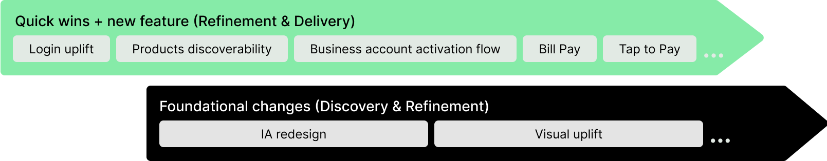
Phased design process: Building foundations and enabling payments
• Quick wins
: Login uplift, product discoverability, activation flow
• New payments feature
: Introduced Bill Pay and Tap to Pay, validating flows through MVPs and beta feedback.
• Foundational changes
: IA redesign to support multi-product growth.
This approach ensured we delivered measurable improvements quickly, while also enabling the app to scale into a payments hub.
Laying the IA Foundation for Growth
• Conducted research (competitor analysis) to identify scalable IA principles
• Facilitated ideation sessions (card sorting, Crazy 8s workshops) to align stakeholders


Structuring navigation for growth
Developed phased recommendations for the navigation structure to ensure adaptability with future features. Removed inconsistent elements like "Cards" in Phase 1 and proposed scalable options for later phases.
This ensures a seamless evolution of the IA alongside business growth.

Visualising and validating use cases
Created lo-fi wireframes using customer data to prioritise scenarios and spot coverage gaps. Refined 30+ home screen use cases with layouts, strategies, and messaging in collaboration with marketing, ensuring both core and edge scenarios were validated.


Prototyping for user testing
Led user testing sessions, interviewing 2 internal stakeholders and 4 small business owners to validate the initial concept and understand how they engage with financial products.

Validating concept and usability through user testing
Led user testing sessions, interviewing 2 internal stakeholders and 4 small business owners.
Conducted 30-minute user interviews with small business owners on loan management apps, followed by 30-minute testing sessions to validate the new IA concept and cash flow management experience.

• All 6 participants successfully understood the purpose of the home screen
• Participants wanted a single, clear entry point for payments.

Facilitating a design jam for visual alignment
I led a brainstorming session with visual and product designers to align on the current home screen’s visual language and develop a unified concept for future enhancements.

Setting the north star for visual excellence
With a validated design and usability foundation, we set a clear north star and long-term vision for the app’s evolution, enabling incremental, sustainable growth through new elements, style, and navigation.

Transforming the first impression
Reimagined the static login page into a dynamic, brand-led entry point with video, clear value props, and streamlined flows like the calculator.
This quick win improved usability, elevated brand perception, and boosted new customer engagement.

Streamlining Business Account activation
Developed a new activation flow to guide customers in adding funds post-signup, addressing a key metric.
By analysing the journey and incorporating dynamic visuals, animations, and illustrations, I simplified the process, enabling easy fund addition from their line of credit with just a few taps.
.gif)
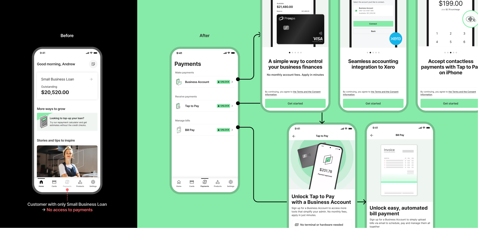
Unlocking access and upsell
Redesigned payment entry with a central hub, streamlining access across business accounts, loans, and credit.
Designed contextual experiences for different customer states—using unlock flows and light gamification to reveal feature value, turning limitations into strategic upsell opportunities while laying the foundation for Bill Pay and Tap to Pay.
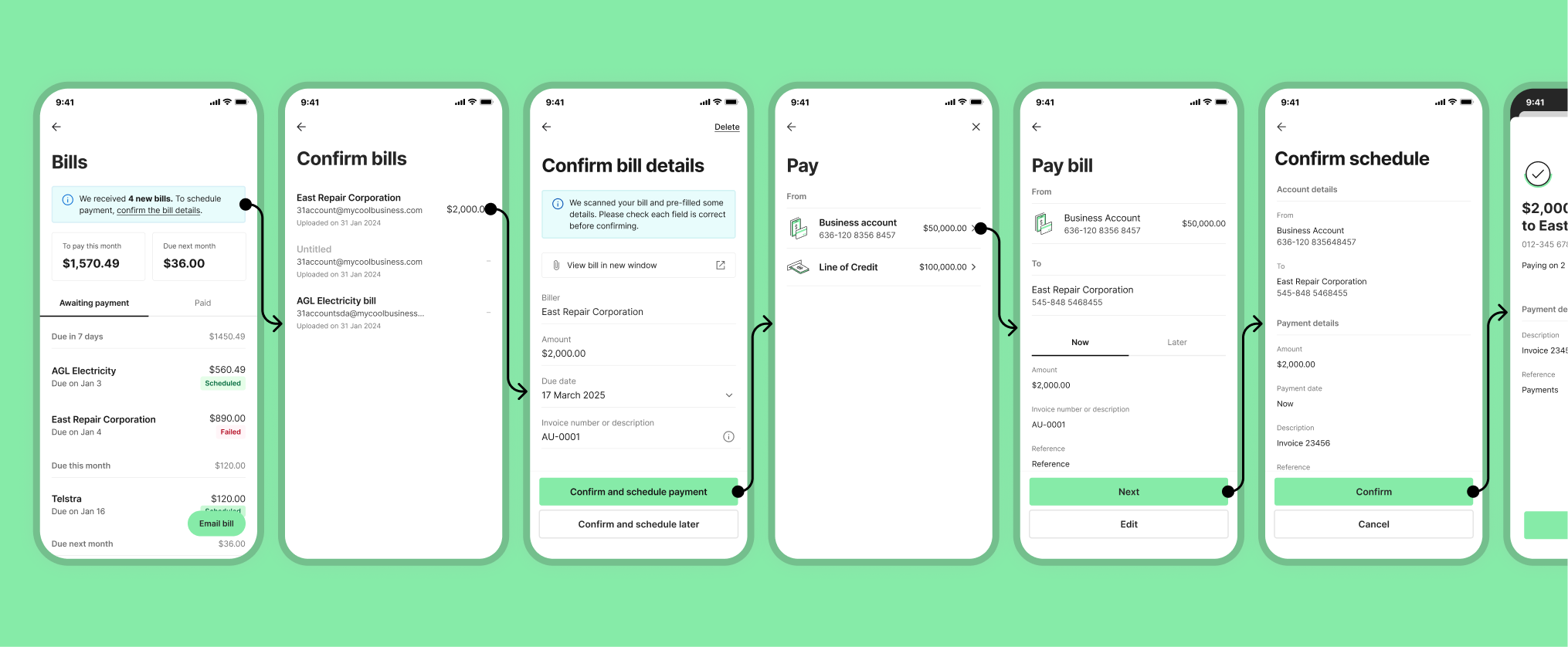
Designing a new way to pay bills
Designed Bill Pay, streamlining how SMEs manage and schedule bills in-app.
The flow simplified confirmations, reduced friction, and enabled flexible payment sources — addressing a key need while expanding Prospa’s payments ecosystem.
See full case study
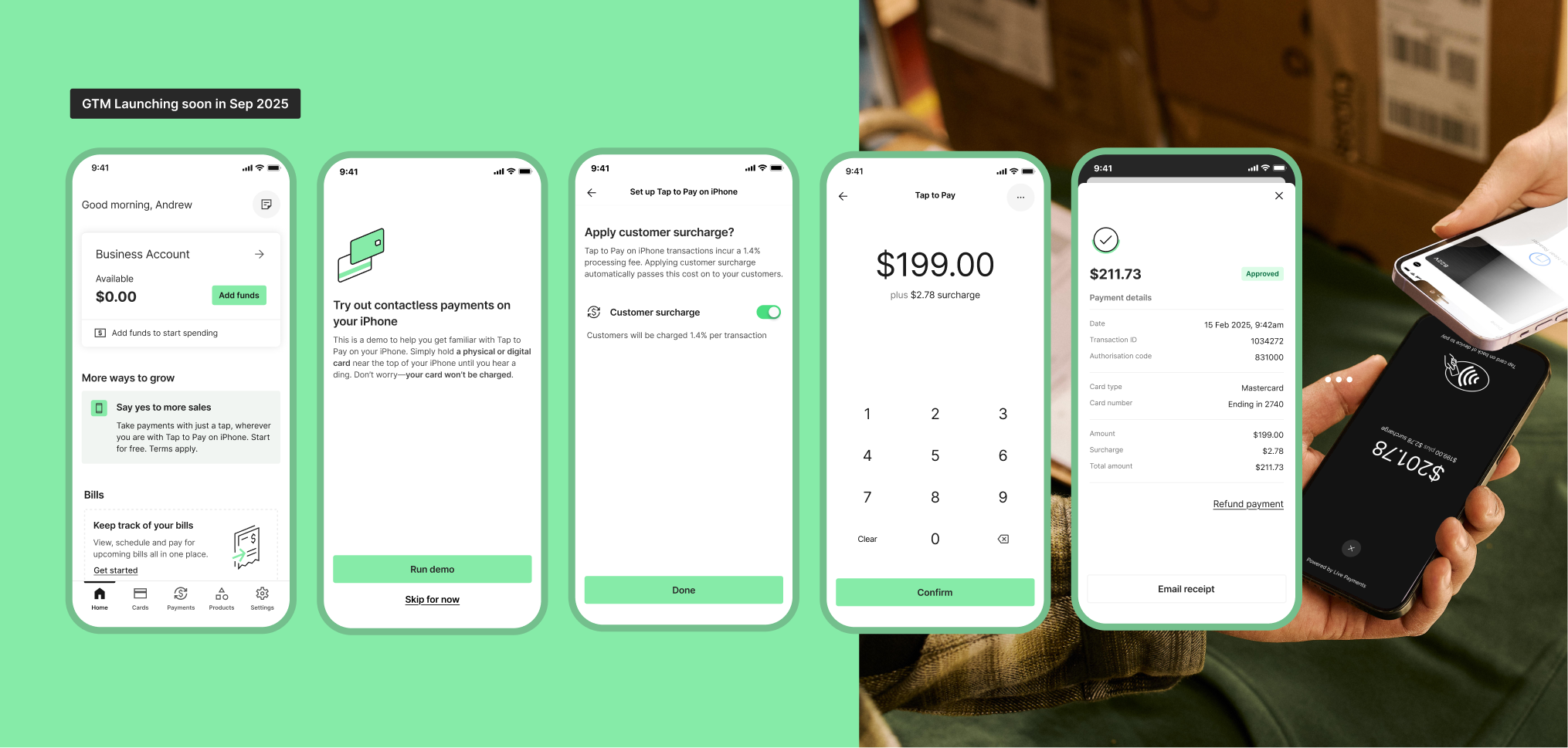
Designing for Real-World Interactions
Led the design of Tap to Pay for iOS and Android, enabling SMEs to take contactless payments on their phones.
Through Beta testing with internal users and early customers, we identified real-world friction points and iterated quickly, delivering a seamless, hardware-free way for businesses to get paid — now near launch.
Driving impactful results through Prospa App uplift
Over 2 years, I led the Prospa App uplift and later expanded my scope to the web product, driving measurable improvements including:
✅ Increased app rating from 3.8 to 4.8 on Apple App Store, 4.3 on Google Play Store.
✅ Boosted monthly active users by 70%.
✅ Achieved a 13% growth in funded Business Accounts (BA) within the first 3 months of the redesign.
✅ Refreshed visual and functional elements, strengthening brand presence and creating a cohesive, premium user experience


Blending design, collaboration, and data for better outcomes
Through this journey, I learned the importance of:
• Collaboration
: Knowing when to step back, engage cross-functional teams, and co-create solutions led to faster, more effective problem-solving.
• Data-informed design
: Integrating hypotheses and measurable outcomes into the design process gave clarity on what worked, ensuring solutions were both user-centric and commercially impactful.
This balance of creative vision and evidence-based decision-making has shaped how I approach design.


